Vida Anáhuac
Context
Vida Anáhuac is the magazine that reflects student lifestyle, leadership, and triumphs at Universidad Anáhuac Mayab. At the time, it came out every two months.
Problem
The magazine had a basic editorial design that only focused on delivering the message without any visual distinction between themes. Since the magazine covers more than just the university itself, we needed a refresh to the editorial system — one flexible enough to adapt.
Solution fresh and free
I designed an editorial system that could break the rules of the grid system, combining different sizes while adapting to whatever theme it needed to communicate.
Outcome
We created two editions of the magazine using a variety of colors, photos, and grids that could represent its versatility while staying true to the university brand.
The challenge
Where we started
We started by understanding what the client wanted. We analyzed the content and past editions to identify the opportunity.
We also had to respect the brand colors for some sections, which could represent a challenge if we wanted to become more versatile.
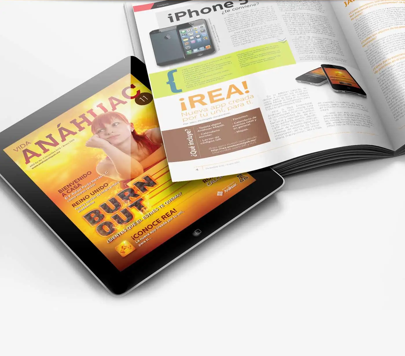 Digital-first
The creation
Creative process
We took a regular grid system as the base; however, we took the chance to break it for every theme we needed to communicate. For example, when we needed to talk about the UK, our grid was based on the flag, so the layout became a series of triangles that could represent it without losing its readability.
We also played with sizes, text rotations, image overlaps, and masks. For the covers, the lead designer often turned to Photoshop to build composite images for high-impact covers.
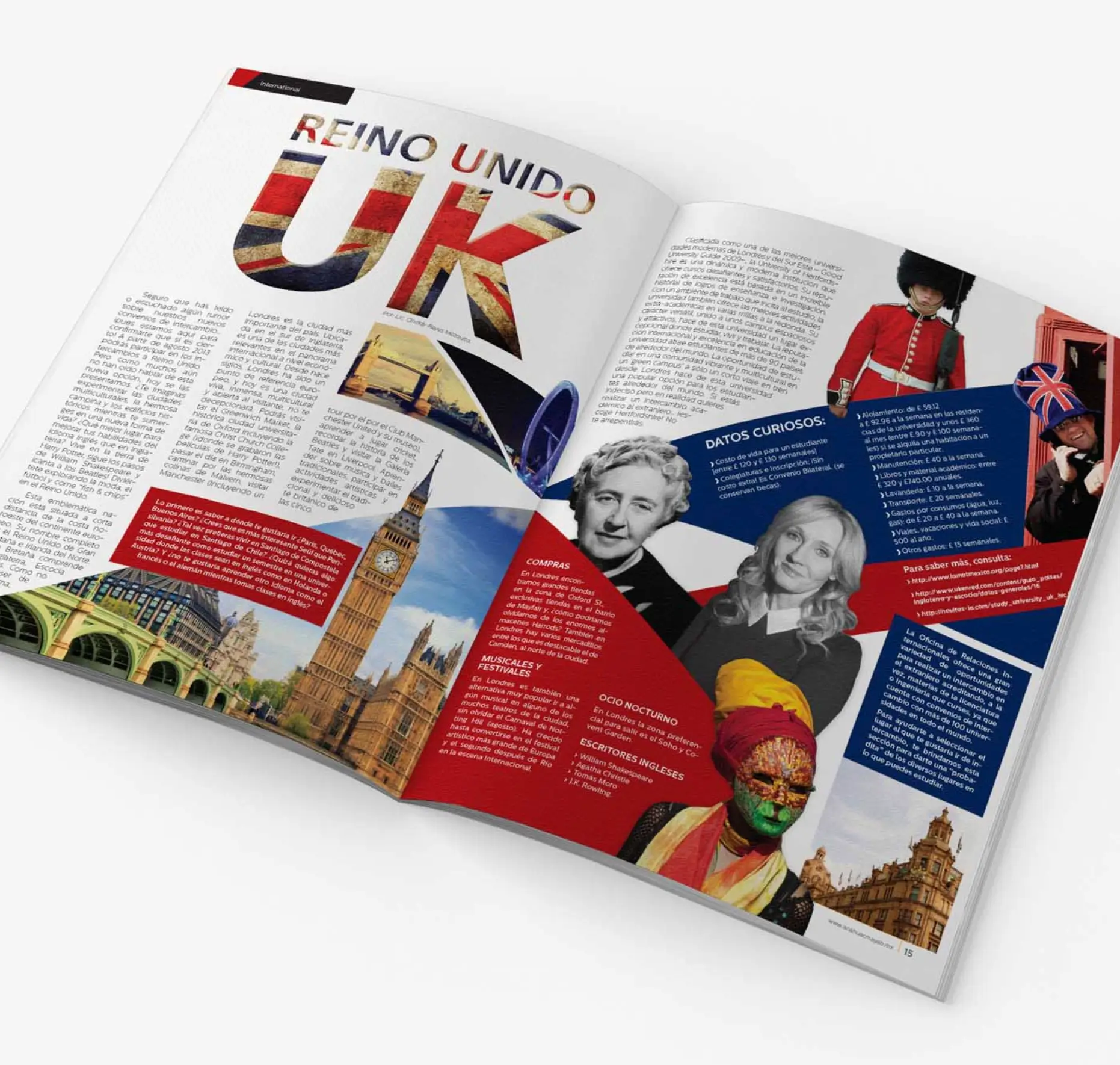 Grid, themed
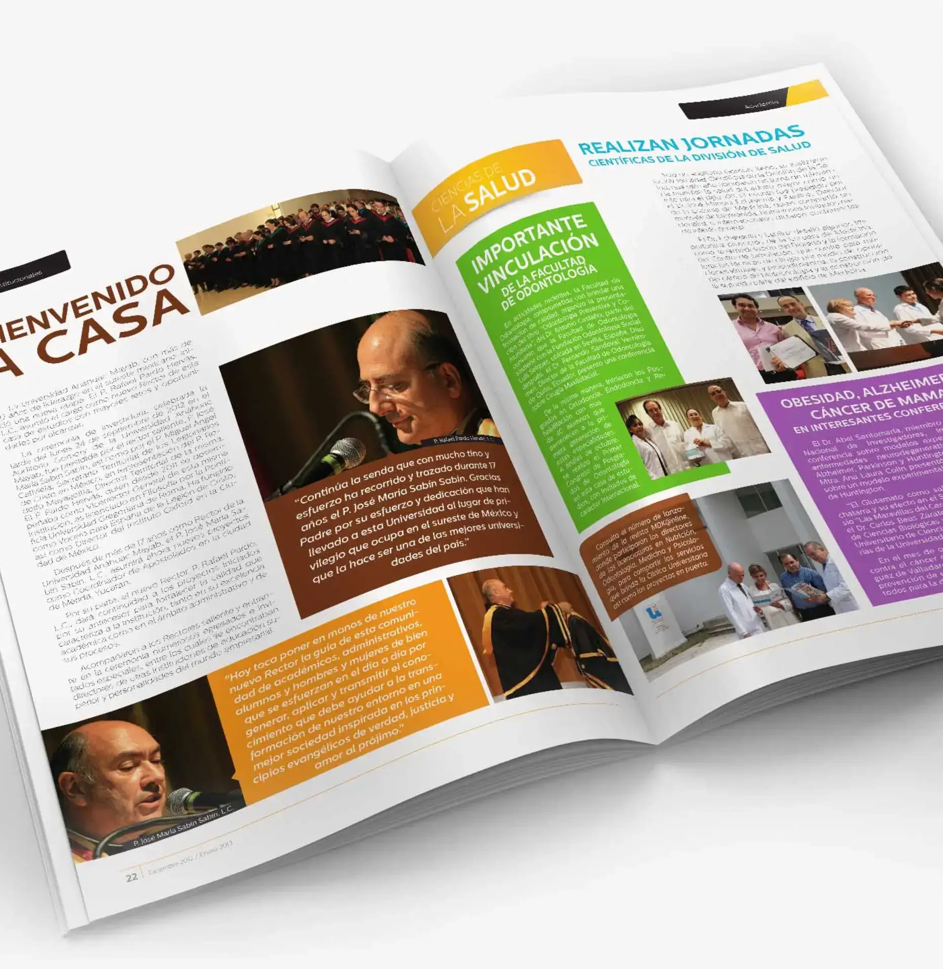 Section system
The impact
Where we landed still active
We nailed it, and the client was happy enough to keep working with the creative agency I was part of at the time.
The magazine was never intended to be printed — it's a digital edition that the university publishes through its official channels. As of August 2026, the magazine is still active, now on a roughly four-month cadence.
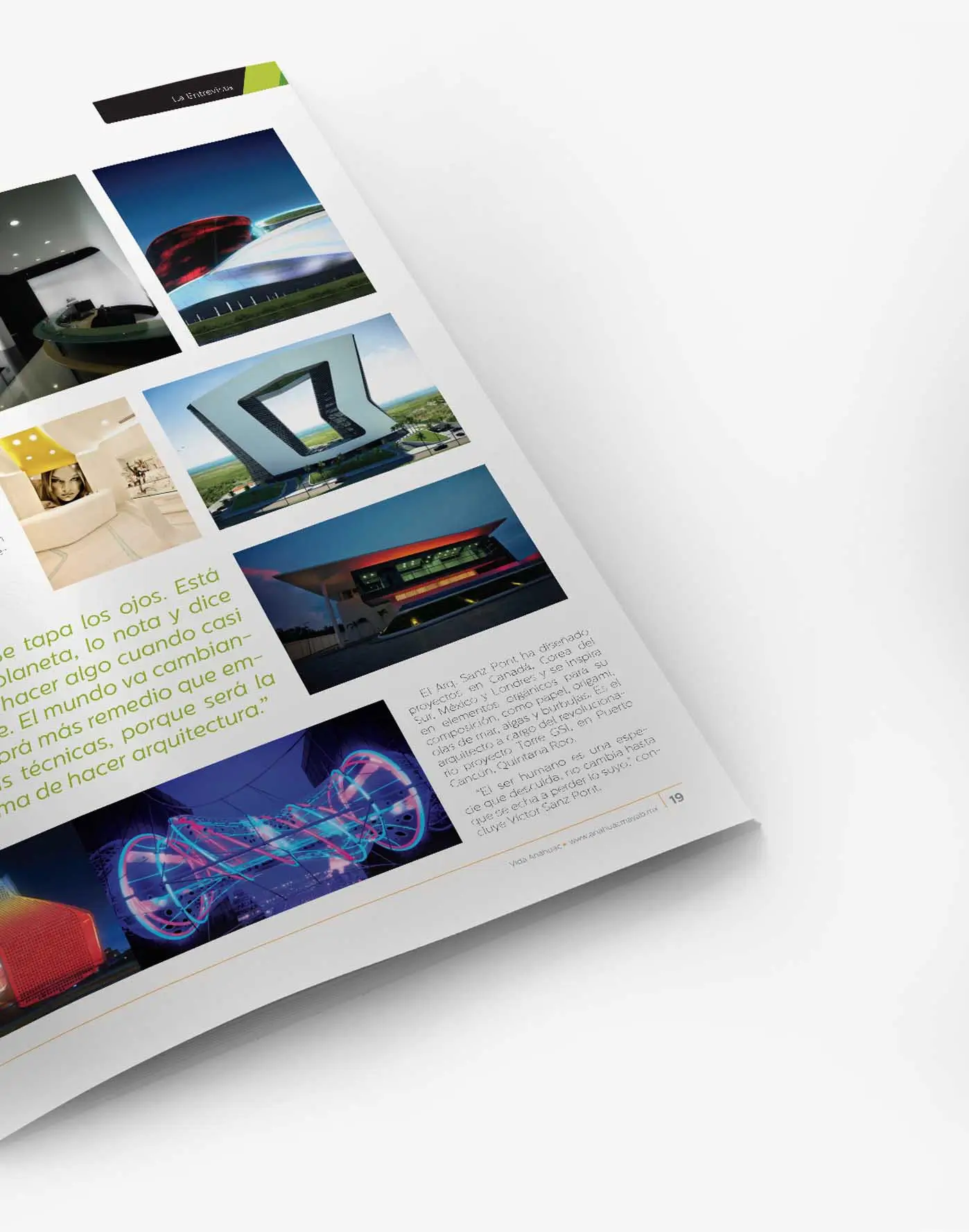 Interview feature
 Road trip