Poder Judicial Yucatán
Context
As part of the client's annual activities report in 2011, I was tasked with delivering a document that clearly communicated how a public institution was investing its assigned funds — accessible, honest, and formally appropriate.
Problem too dense to trust
Annual reports are commonly too dense, poorly legible, and without visual hierarchy. Data and key activity stats were displayed with no visual treatment. The challenge was making it accessible while keeping it legal and formal.
Solution data-focused
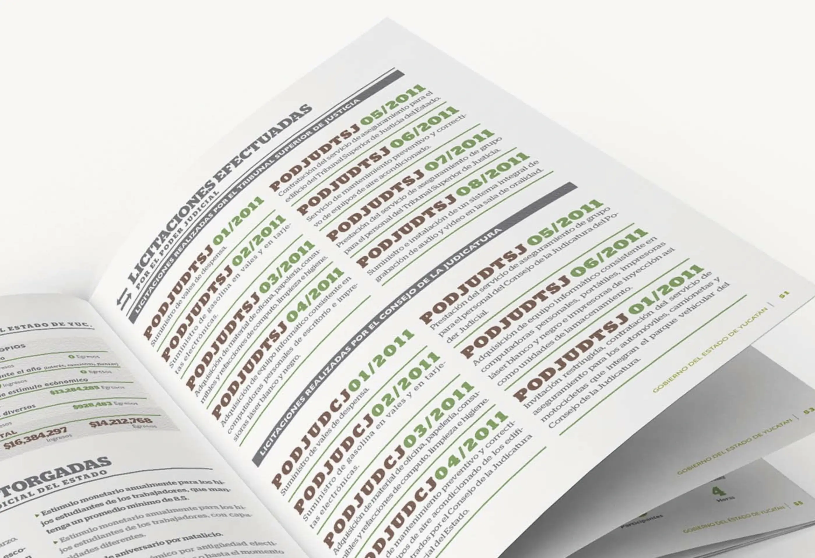
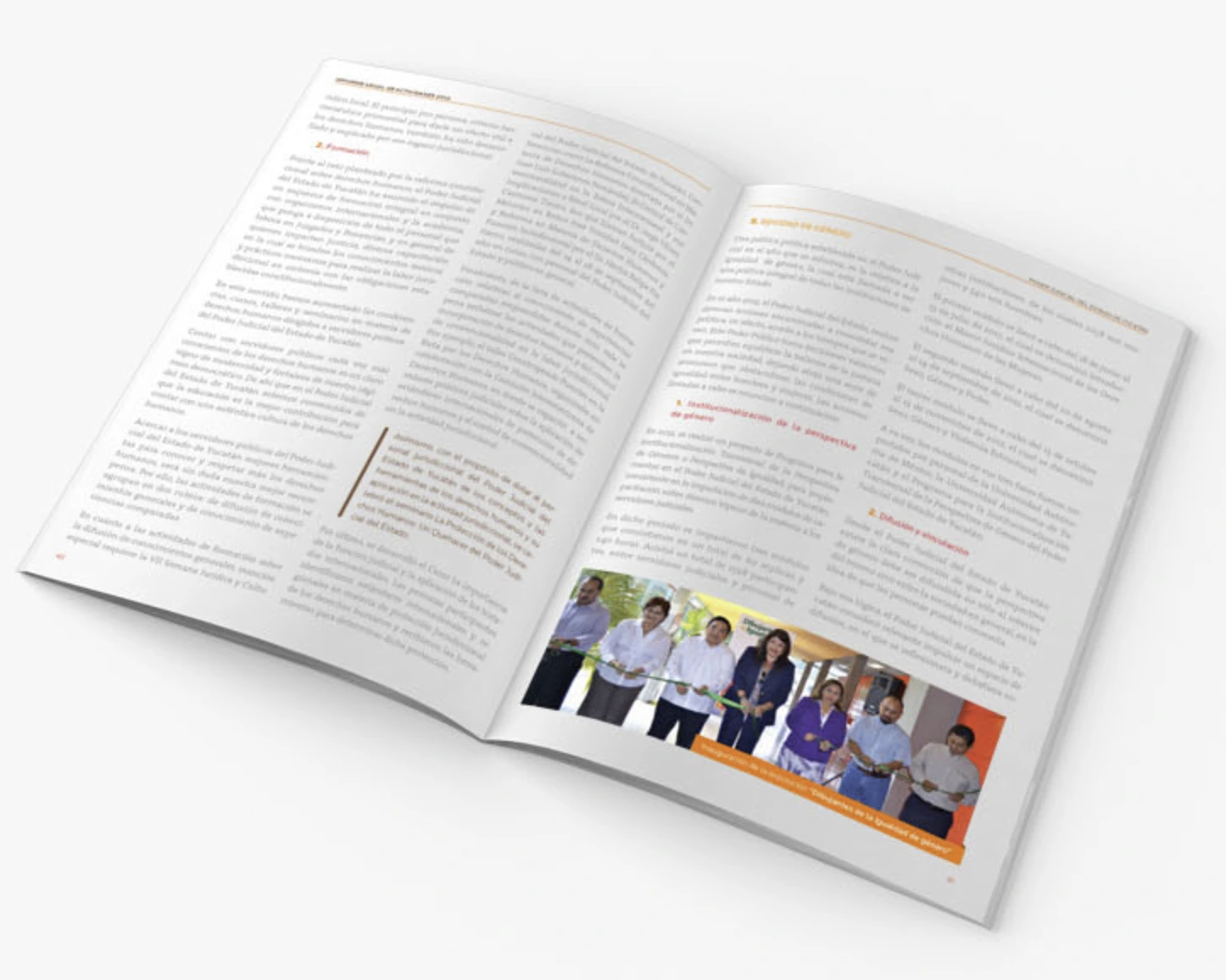
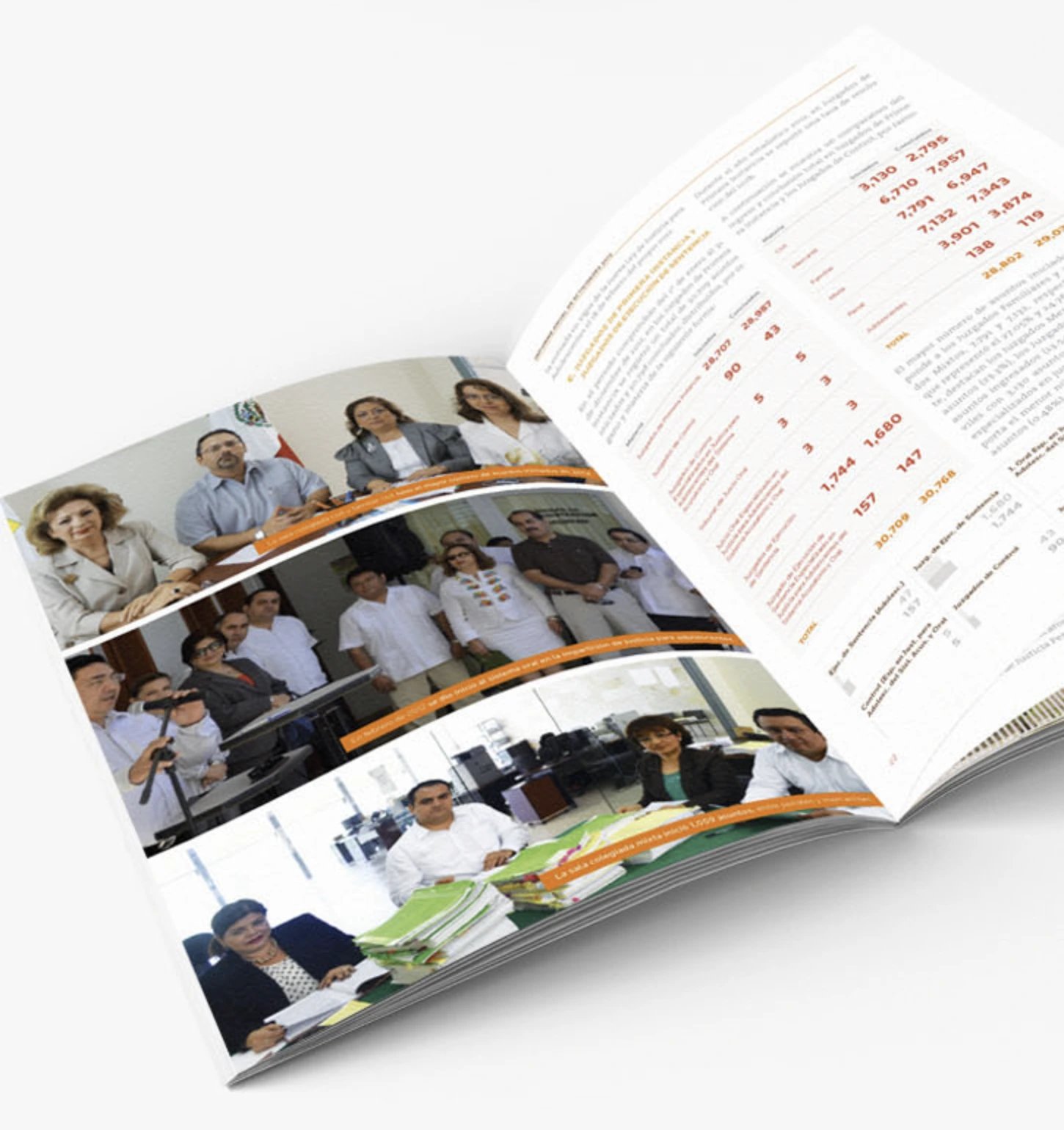
I designed an editorial system built around an introduction, narrative, themed sections, and stats. Color, font variants, and structure gave the data life and made it easy to scan and compare. We stayed aligned to the brand colors and photography to communicate confidence and transparency.
Outcome
The report was well received and praised by the chairman at the time. The results earned me a second edition the following year.
The challenge
Where we started
We began by analyzing the data: what types of charts were most commonly used, what the client wanted to communicate, and how to build a grid that could hold it all together.
- We discussed the direction the client wanted to follow in order to define a clear hierarchy system.
- We collected information from multiple sources, sometimes declining assets because of their quality or relevance.
The biggest constraint wasn't technical — it was tonal. This was a government institution. Every design decision had to feel trustworthy, not creative for the sake of it.
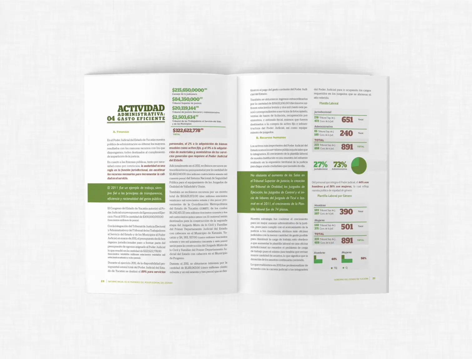 Editorial spread
The creation
Creative process
We built a two-column grid and used color, font sizes, and variants to highlight information where it mattered most.
Glypha and Frutiger were chosen for their complementary qualities — one institutional, one humanist. Together they create a visual harmony that makes a long document feel unified and readable without losing its formal character.
The color palette stayed aligned to the government brand, with complementary colors added specifically for stats and tables. The cover features a well-known photograph of the building alongside the statue of Jacinto Pallares López — known as the first advocate of the Republic — grounding the report in its institutional identity from the first page.
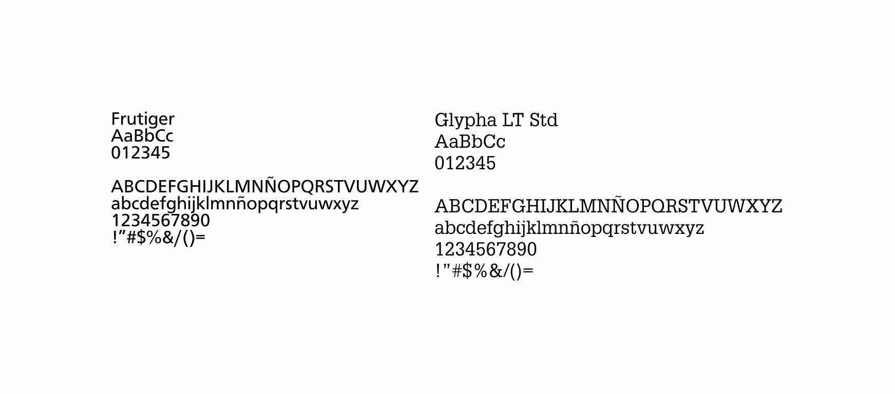 Typography
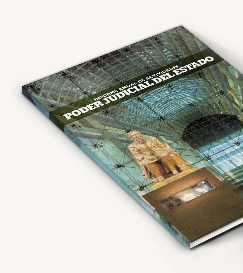 Cover
Cover
The impact and next steps
Where we landed invited back
The report was released both digitally and physically. It wasn't meant for mass print, but what it did was set a new standard internally — the first time the organization had published something with a real editorial system behind it.
The work continued
The following year, I was invited back to work on the second edition — building on the same system while introducing new ideas and refinements.
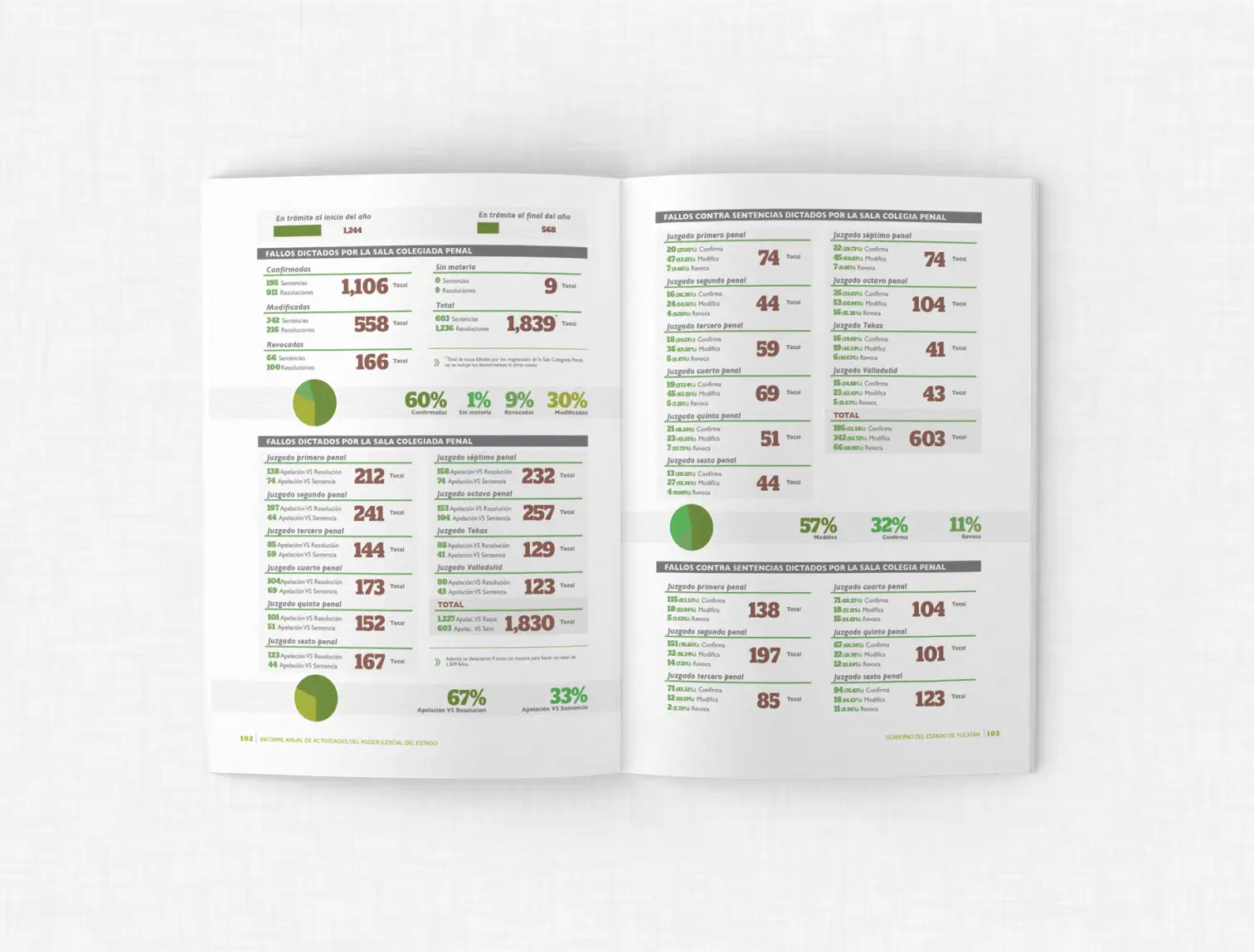 Data spread
 Data visualization
 2012
2012
 2012
2012